Your Screenshots Are Excluding People—And You Probably Don't Know It
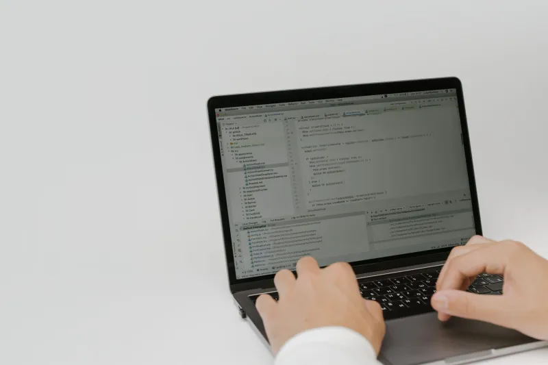
Let's be honest: when most developers think about accessibility, they're thinking about ARIA labels, keyboard navigation, and color contrast ratios in UI components. Screenshots? Those feel like a different department's problem—maybe marketing, maybe the tech writers, definitely not engineering.
Except they are engineering's problem. And design's problem. And increasingly, they're a legal problem.
The way technical teams create, annotate, and share screenshots has a direct impact on whether a meaningful chunk of their audience can actually use that content. We're talking about developers who are blind or have low vision, users with color vision deficiencies, and people who rely on screen readers to navigate documentation. In the US alone, roughly 12 million people have some form of color blindness, and around 7 million have a visual impairment that isn't correctable with standard lenses. These aren't edge cases. They're colleagues, customers, and contributors.
The Legal Landscape Isn't Waiting for You to Catch Up
The Americans with Disabilities Act has been applied to digital content with increasing frequency over the past decade. Web Content Accessibility Guidelines (WCAG)—currently at version 2.2, with 3.0 in development—are the de facto standard that courts and regulators reference when evaluating whether digital content meets accessibility requirements.
ADA-related web accessibility lawsuits in the US exceeded 4,000 in 2023, and the trend line is pointing up. Developer tools, technical documentation platforms, and SaaS products with help centers are not immune. If your documentation includes annotated screenshots that a screen reader can't parse, or diagrams that rely entirely on red-green color coding to convey meaning, you may already be out of compliance.
This isn't meant to be alarmist—it's meant to be clarifying. Accessibility isn't a nice-to-have that you get to once the roadmap clears. It's a baseline expectation, and the screenshots embedded in your technical content are part of that equation.
What Makes a Technical Screenshot Inaccessible
Unlike a decorative stock photo that just needs an empty alt attribute, a technical screenshot is doing real communicative work. It's showing a configuration panel, a code diff, a terminal output, an architecture diagram. When that content isn't accessible, users who rely on assistive technology don't just miss out on aesthetics—they miss out on the actual information.
Here are the failure modes that show up most often in technical contexts:
Missing or useless alt text. Alt text on a screenshot that says "screenshot" or "image of dashboard" is essentially the same as no alt text. A screen reader user deserves the same information a sighted user gets from looking at that image. That means describing what the screenshot shows—the specific UI state, the key data points, the action being demonstrated.
Color as the only differentiator. Annotated diagrams that use red to indicate errors and green to indicate success are inaccessible to a significant portion of your audience. If color is the only way meaning is encoded, you've excluded users with red-green color blindness—one of the most common forms of color vision deficiency.
Low contrast annotations. Yellow text on a white background. Light gray callout boxes. Thin arrows that disappear against busy backgrounds. These are common in quickly-assembled screenshots and they make content difficult or impossible to read for users with low vision, even without a diagnosed disability.
Images of text without a text alternative. Code snippets captured as screenshots rather than rendered as actual code blocks are a particularly common problem in developer documentation. A screen reader cannot parse text inside an image. Neither can a search engine, for that matter.
No long description for complex diagrams. An architecture diagram showing microservice relationships, data flows, and external dependencies cannot be meaningfully summarized in a short alt text string. Complex visuals need a long description—either as a text block adjacent to the image or linked from it.
Making It Better Without Making It Harder
The good news is that accessible screenshot practices don't require a complete workflow overhaul. They require intentionality at a few specific points in your process.
Write Alt Text Like You're Describing It to a Colleague on the Phone
That framing actually works well. If a teammate called you and said "I can't see the image in the doc—what does it show?" what would you say? That's your alt text. For a screenshot of a GitHub Actions workflow with a failed step highlighted, you might write: "GitHub Actions workflow run showing three completed steps and one failed step labeled 'Deploy to Production,' with a red X icon and timestamp of 14:32 UTC."
That's specific, informative, and useful.
Add Shape and Pattern to Color-Coded Annotations
If you're using color to categorize or differentiate elements in a diagram, add a secondary visual cue. Use distinct shapes (circle vs. triangle vs. square), fill patterns (solid vs. hatched vs. outlined), or direct labels. This redundancy doesn't clutter the diagram—it makes it readable for everyone.
Tools like Figma, Sketch, and even PowerPoint support pattern fills and shape libraries that make this straightforward.
Check Your Contrast Before You Publish
WCAG 2.1 requires a contrast ratio of at least 4.5:1 for normal text and 3:1 for large text. Annotation text on screenshots falls under this standard. Plugins like Stark (available in Figma and Sketch) and browser-based tools like WebAIM's Contrast Checker make it fast to verify you're hitting the mark before an image goes live.
Use Real Code Blocks Instead of Code Screenshots
This one benefits accessibility and SEO simultaneously. If you're documenting a command, a config snippet, or a function—use a formatted code block in your documentation platform, not a screenshot of your IDE. Reserve code screenshots for situations where the visual context of the editor itself is part of what you're communicating.
Document Your Accessibility Standards for Visual Assets
Just like your screenshot hygiene guide (you're building one, right?), your team should have a short reference for accessibility expectations on visual content. What's required for alt text? What's the minimum contrast ratio for annotations? What's the process for complex diagrams? Written standards create consistency and give reviewers something concrete to check against.
Accessibility Is a Feature, Not a Footnote
The developers and designers building tools for other technical professionals tend to assume a narrow user profile—someone who sees exactly what they see, uses the same setup, and navigates the world the same way. That assumption is worth examining.
Your documentation, your help center, your internal runbooks—they serve a broader audience than you might think. Building accessibility into how you capture and share technical visuals isn't a compliance checkbox. It's a signal that your team builds things that work for people, not just for the default case.
And in an industry that talks a lot about inclusion, that signal matters.