The Screenshot Trap: Why Async Visual Sharing Creates More Confusion Than Clarity
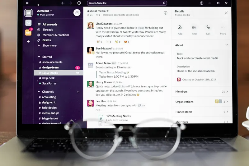
There's a moment every distributed team knows well. Someone drops a screenshot in Slack, adds a vague caption like "this looks wrong to me," and disappears into their timezone. Eight hours later, three people have replied with completely different interpretations, someone's tried to reproduce an issue that was already fixed, and the original poster is asleep. Congratulations—you've just experienced async visual collaboration at its most chaotic.
Screenshots feel efficient. They're fast to capture, easy to share, and they seem to replace a thousand words of explanation. But that efficiency is often an illusion. The real cost of leaning too hard on async screenshot sharing shows up slowly, in the form of misread context, annotation pile-ups, and the exhausting cognitive work of trying to reconstruct what someone actually meant when they circled something in red and wrote "??"
The Context Problem Nobody Talks About
Here's the thing about a screenshot: it captures a moment in time, stripped of almost everything that made that moment meaningful. You see the UI. You don't see the user journey that led there. You see the error message. You don't see the three steps someone took before it appeared. You see the design mock. You don't hear the ten-minute Figma walkthrough that explained the intent behind it.
Synchronous tools—video calls, screen shares, live design reviews—carry context automatically. When you're watching someone navigate a bug in real time, you absorb the surrounding information without even trying. Async screenshots force the recipient to reconstruct that context from scratch, usually with incomplete information.
This is what we'd call the "reading between the pixels" problem. Your teammate isn't just looking at what you sent—they're actively inferring what you meant, what state the app was in, what you were trying to accomplish, and what kind of response you're looking for. That's a lot of invisible cognitive labor being pushed onto the receiver.
When Annotations Become the Problem
The natural response to context-stripped screenshots is to annotate the heck out of them. Arrows, circles, numbered callouts, sticky note overlays—annotation tools have gotten genuinely impressive, and it's tempting to use all of them.
But annotation overload is a real phenomenon. When a screenshot arrives buried under seven overlapping arrows and a paragraph of embedded text, the viewer has to parse the annotation layer before they can even process the underlying visual. Worse, heavy annotation can actually introduce new ambiguity. Which arrow goes with which note? Does that red circle mean "this is broken" or "look at this area"? Is the highlight calling attention to a problem or marking a solution?
Annotations work best as a light touch—a single callout, a quick directional cue, a numbered sequence when order genuinely matters. When you find yourself building an elaborate annotation system on top of a screenshot, that's usually a signal that what you actually need is a short Loom video or a five-minute call.
The Psychological Weight of Async Visuals
There's also an emotional dimension to this that doesn't get discussed enough. When someone sends you a screenshot with minimal context, there's a low-level anxiety that comes with interpreting it. Did I break something? Is this a criticism of my work? Is this urgent or is it just an FYI?
In synchronous communication, tone and intent are conveyed through voice, body language, and real-time back-and-forth. Async visuals strip all of that away. A screenshot of a broken layout lands differently depending on whether it was sent with "hey quick question" or dead silence, and most of the time you're working with dead silence.
For design and dev teams doing regular async reviews, this psychological overhead compounds over time. People start second-guessing their interpretations, over-explaining their own screenshots defensively, or avoiding async visual feedback altogether because the signal-to-noise ratio has gotten too low.
So When Do Screenshots Actually Work?
None of this means screenshots are bad. They're genuinely one of the best tools in a distributed team's arsenal—when used in the right situations.
Screenshots shine when:
- The visual speaks for itself. A 404 page, a rendering glitch, a color that's clearly off-brand—these don't need much scaffolding. The problem is obvious at a glance.
- You're documenting a state, not a process. Capturing what a dashboard looks like at a specific point in time, logging a UI state for a bug report, or archiving a design version are all great screenshot use cases.
- You're referencing something, not explaining something. "Here's the component I'm talking about" is a perfect use of a screenshot. "Here's everything that's wrong with the component" usually needs more than a static image.
- The audience has shared context. A screenshot dropped into a thread where everyone's been actively working on the same feature lands very differently than one dropped cold into a general channel.
A Framework for Choosing Your Communication Tool
Before you hit that screenshot button, run through a quick mental checklist:
- Can the recipient understand this without any prior knowledge of the current state? If no, add context or switch tools.
- Does the order of events matter? If yes, a screen recording or written step-by-step will serve you better.
- Are you asking for interpretation or confirmation? Interpretation requests almost always need more context than a screenshot can carry.
- Is this time-sensitive? If you need a response in the next two hours, async visual sharing is probably the wrong channel entirely.
The teams that use async visual collaboration most effectively tend to treat screenshots as one tool in a larger communication system—not as a default. They pair screenshots with brief written summaries, use screen recordings when process matters, and establish shared norms around annotation conventions so nobody's left guessing what a red circle means.
Building Better Visual Habits
If your team is drowning in decontextualized screenshots and annotation chaos, the fix isn't to ban screenshots—it's to be more intentional about when and how you use them.
Start by auditing your last two weeks of screenshot-based communication. How many required follow-up questions to clarify? How many were misinterpreted on first read? How many could have been replaced with a 90-second screen recording or a two-sentence written description?
The answers might surprise you. And they'll give you a much clearer picture of where your async visual workflow is actually breaking down—and what it's costing your team in time, clarity, and mental energy.
Screenshots are powerful. But power tools work best when you know which job they're actually suited for.